Posters aren’t just for dorm rooms anymore – with the right styling, they can make any space look polished and upscale. High-quality prints add vibrancy and sophistication when paired with good framing and decor. Think of each poster as an art piece: choose ones you love, and then style them thoughtfully. On a budget, even an IKEA frame and print can look gallery-worthy. The key is presentation. When chosen and arranged well, posters can feel as luxurious as expensive art. You can personalize your space without overspending – it’s all about the styling.
Choose the Right Size and Frame
Go big
A common mistake is undershooting poster size. A large poster or print fills a wall and creates impact. As WindowShopGal advises, when in doubt, “go one size up”.
Viewers see art from across the room, so a slightly oversized print will catch the eye (what looks “too big” up close often looks just right on the wall). For example, if a blank wall looks empty, swap an 18×24″ print for a 24×36″. A bigger piece will anchor the space better.
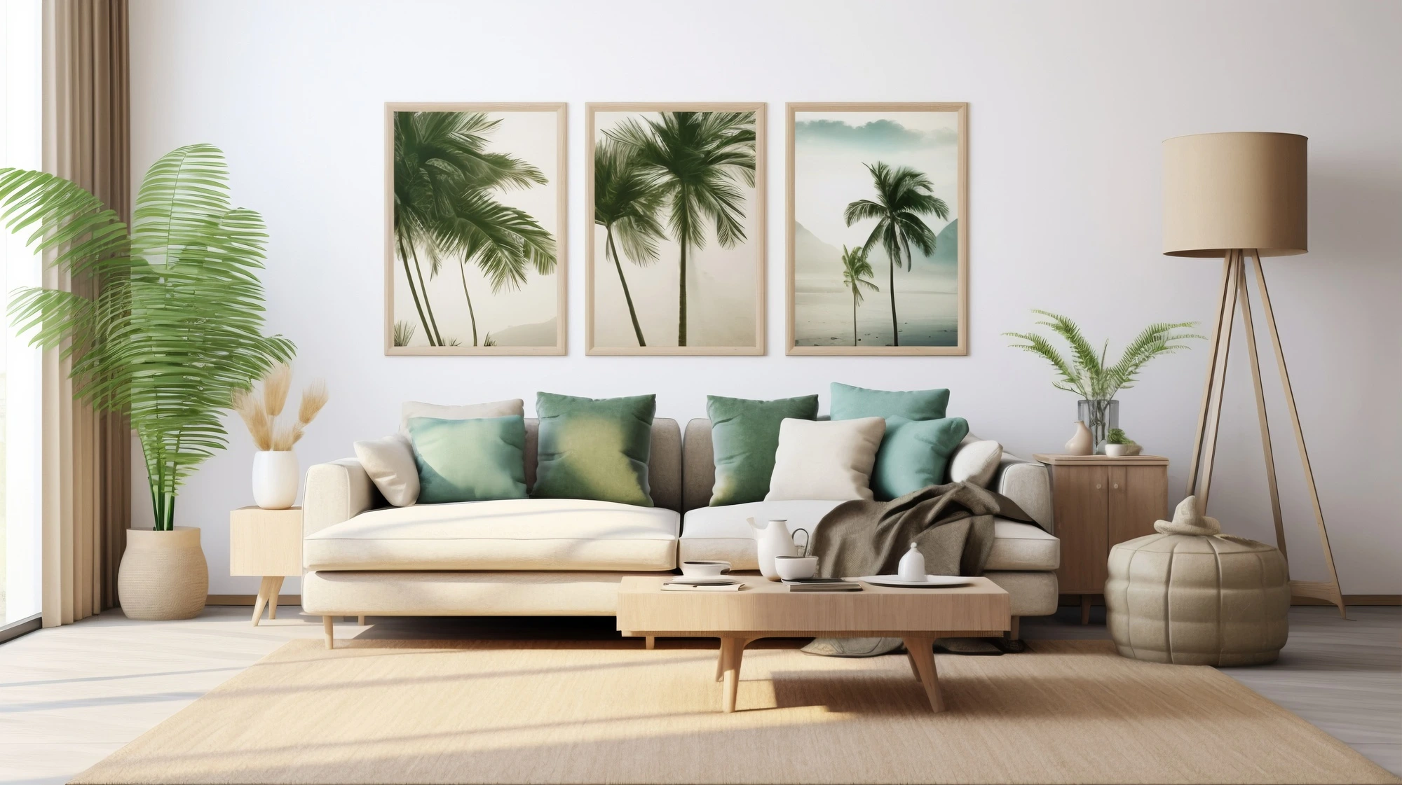
Frame it well
The right frame ties the look together. Thin black or white frames are a safe, modern choice that let the art shine. Natural wood frames bring warmth to earthy or Scandinavian-style spaces.
If your poster has a vintage or formal vibe, an ornate gold or silver frame adds a touch of elegance (think museum gallery). You can even mix frame styles: for a gallery wall, try combining two or three styles in a cohesive palette (for example, black, white, and wood frames). This mix keeps the display interesting without feeling random.
Go frameless or floating for an easy twist
Poster hangers (wooden magnetic strips at top and bottom) clamp the print and hang by a cord
. They’re lightweight and allow you to swap prints in seconds – perfect for renters or seasonal changes.
Plus, with no glass to reflect light, the colors pop fully. Another high-end touch is using a wide mat around the poster inside the frame. A generous white or cream mat gives “breathing room,” making even a small print feel dramatic and gallery-ready. (Floating frames or shadow boxes similarly create depth, as if the art is suspended in space.)
Pick a Color Scheme and Theme
A poster can set your room’s palette. Pull 2–3 key colors from the artwork and echo them in accessories. For instance, if your print has teal and coral accents, find throw pillows or a rug with those tones.
This tricks the eye into seeing a planned design. Using your wall art as a color guide “pulls the look of your entire room together”. If your furniture is neutral (grays, browns, whites), let the poster provide the accent colors in small doses around the room. Laboostudio’s hanging tips also advise coordinating posters with existing decor: “Repeat colors or shapes from your posters in your throw pillows, bedding, or rug” for a cohesive look.
Consider an overall theme or style for your prints. Maybe you love botanicals, modern abstracts, or graphic typography – sticking to one style family makes the collection feel intentional. For example, a series of black-and-white photography or line-art prints yields a clean, sophisticated mood, while colorful travel posters or retro designs create an energetic, eclectic vibe. The LabooStudio guide suggests picking pieces that match the mood you want (e.g., bold patterns for statement, or calm neutrals for serenity). The easiest route is choosing art you already connect with, then building accessories (like cushions or throws) around those colors.
Create an Eye-Catching Layout
The arrangement of your posters can elevate the space dramatically. A gallery wall – multiple prints grouped – is a classic way to look high-end. As Daring Dutch Designers explain, mixing posters of different sizes and styles can be bold and playful.
- The trick is to plan before hanging: lay your prints on the floor or use painter’s tape outlines on the wall to find a pleasing layout.
- Start with your largest piece as an anchor, placing it slightly off-center or in a corner.
- Then build around it by balancing a second large piece diagonally opposite.
- Fill in gaps with smaller or medium prints.
- Mix vertical and horizontal frames for interest, but keep 2–3 inches between each frame so the wall “breathes.”
If a full gallery wall feels like too much, a single large poster can also be a showstopper. Hanging one big print above a sofa or bed instantly grounds the room. Daring Dutch suggests keeping the surrounding decor simple so the art gets the spotlight. Whether one poster or many, always hang art at eye level: about 57–60 inches from the floor to the center of the frame.
Also, when placing art above furniture (like a couch, console, or headboard), leave about 6–8 inches of space above the furniture’s top so the pieces feel connected. This avoids the floating-in-space look and makes the wall styling seem intentional.
- To keep things balanced, group prints in odd numbers (3 or 5 pieces often look more dynamic than 4).
- If you’re working with multiple posters of similar size and theme, a grid layout can be very clean and modern. Just maintain consistent spacing and alignment.
- Even a mix of different poster styles can look cohesive if you stick to a color palette and keep the gaps uniform.
Finally, don’t forget odd spots: try leaning a large framed poster on the floor against a wall, or placing a mini gallery in a corner or niche. - These casual arrangements (a poster propped by a reading chair, for example) add a relaxed, magazine-like feel to the room.
Placement Ideas by Room
Different rooms have different needs, but posters can enhance any space:
Living Room
- Over the sofa or mantle is prime real estate.
- Hang a large poster or a balanced gallery to define the seating area.
- An oversized print above the couch draws the eye and becomes an instant focal point.
- If you have an open floor plan, a big print on the back of the couch or a dividing wall can even help zone the living area without building partitions.
Bedroom
- The wall behind the bed is often the first thing you see, so use it for artwork.
- A single large piece or symmetrical pair of framed posters can set the tone.
- If you have a reading nook or desk in the room, hang a smaller collection of inspiring prints there (motivational quotes by a workspace, or calming images by a lounge chair).
Home Office/Study
- Posters are perfect for personalizing workspaces.
- Inspirational quotes, travel posters, or abstract art can make the office feel inviting.
- Arrange them above the desk as a gallery or a single art.
- The key is not to clutter: a clean cluster of 3–5 prints keeps it professional yet personal.
Hallways & Corners
- Long hallways can display a horizontal row of related posters.
- Even small prints can turn a boring corridor into a gallery.
- Don’t neglect corners or nooks: a framed poster above a side table, or a vertical line of prints on a narrow wall, instantly makes even a tight space look curated.
Kitchen and Dining
- Smaller, whimsical posters (food art, typographic prints) can work in kitchens or breakfast areas.
- Since kitchens see moisture and light, use inexpensive prints in easy-to-clean frames, or stick to open shelving display (for an accessible gallery feel).
Whatever the room, placement intention matters. Hang at the recommended height (57–60″ center), cluster or center artworks over furniture, and adjust to your eye level and how you use the space. In multi-use spaces, posters can even act as zone dividers: a tall print or series of prints can subtly separate the dining area from the living area without building a wall.
Elevate with Lighting and Accessories
Small touches can make posters look high-end. Lighting, in particular, can add a gallery-like glow. A narrow picture light mounted above a framed poster brings elegance. As a rule, position it about 6–7 inches above the artwork and tilt it downward at ~30 degrees.
This evenly illuminates the print without glare. Soft accent lighting makes the colors pop and gives an “elegant, luxurious” vibe. If hardwiring isn’t practical, even a small plug-in or battery-operated picture light does wonders. In a pinch, string lights or an adjustable floor lamp can also highlight a favorite print and cozy up the corner.
Mats and mounts
As mentioned, an oversized white mat inside the frame creates a museum effect. Another DIY trick is float-mounting prints on a backing (e.g., inside a deep frame or clip) so they appear to “hover” above the wall. This simple trick instantly elevates everyday prints.
Also, consider placing framed posters on a decorative shelf alongside books, plants, or sculptures. Blythe Interiors suggests pairing frames with vases or books that tie into the art’s colors.
For example, if your poster has greenery, add a plant pot of a similar hue on the shelf. This layered styling (art + objects) makes the wall look deliberately styled, not random.
Colorful accents
Tie in pillows, throws, or rugs to your poster’s palette. Repeating a poster’s accent color in a cushion or wall mat unifies the room.
Even a table lamp with a colored base can pick up a shade from the print. These accessories cost far less than new art, but make the whole design feel intentionally put together.
Posters as Affordable “Fine Art”
With the above techniques, posters can mimic fine art at a fraction of the price. Modern printing means high-quality posters can approach the look of original paintings. Framed thoughtfully, they “blend seamlessly with more traditional art forms,” pairing well even with upscale furniture. Many designers use posters to update a room’s style quickly. For instance, sticking with a limited color scheme and hanging at the right height can make a $30 poster look like a $300 one.
Framed posters “feel more refined and permanent,” whereas unframed ones look casual. If you want a polished look, invest in simple, uniform frames; if you prefer a laid-back vibe, tape or clips can be charming too. Ultimately, the consistency is what sells the “expensive” feel: consistent framing, spacing, and alignment tricks the eye into seeing a curated collection.
Even lighting and hang techniques are the same as for “real” art. Hanging at eye level, grouping by theme, and highlighting pieces with accent light – these are all gallery tricks. Picture lights, in particular, are a designer favorite for instant sophistication.
Make It Personal and Fun
The best part? You can switch posters out seasonally or whenever you want. Need a mood change? Simply swap in prints with new colors or themes. The Daring Dutch designers even suggest rotating posters with the seasons (florals for spring, warm tones for fall) to keep the decor fresh. And because posters are so affordable, it’s no loss to refresh them often.
Above all, your posters should reflect you. Use prints that tell a story or share your interests – music, travel, quotes, or abstract art you connect with. Don’t be afraid to break the “rules” if it feels right. A random magnet board, a fabric wall hanging, or an unframed collage can be the twist that makes your wall unique.
Finally, remember that even walls themselves can guide the design. Use adhesive putty or strips to hang prints safely on rental walls. Keep spacing consistent (2–3″) so everything looks neat. In the end, posters are an easy, budget-friendly way to complete a room. With thoughtful placement, coordinated colors, and a little flair from lighting or mats, your wall can look like a curated gallery – and feel uniquely yours.