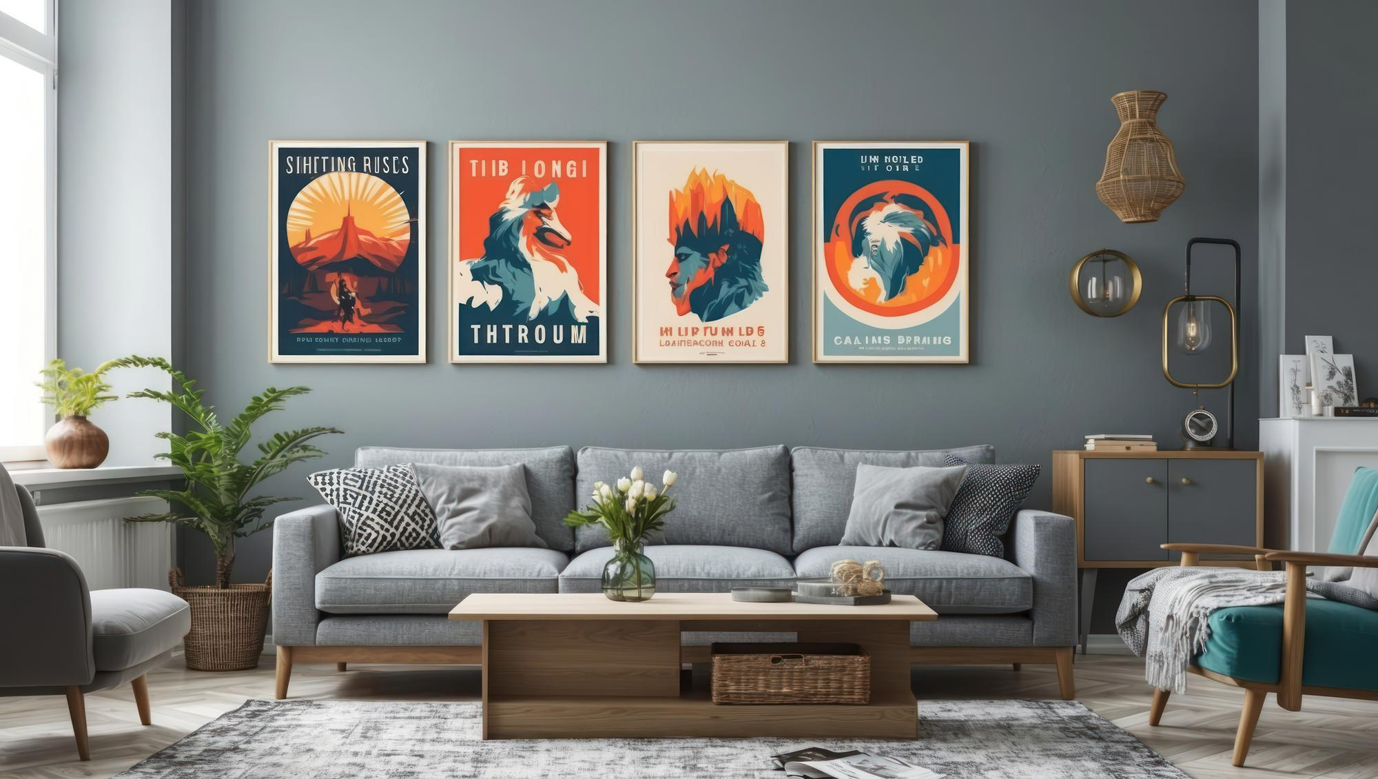
Choosing the right wall art can transform a room. To make sure your print feels like it belongs, start with the color wheel. Complementary colors (opposites on the wheel, like blue-orange or red-green) create a bold, high-contrast look. For example, a teal-blue living room can pop with an orange-accented art print.
In contrast, analogous colors (neighbors on the wheel, such as blue-green-yellow) give a more harmonious, soothing vibe. A green-walled room, for instance, might feel calm and cohesive with artwork that includes blue and yellow hues. Neutral walls (white, gray, beige) are especially forgiving – almost any color pops against them. In a neutral space, consider art with just a subtle touch of color to add interest without overwhelming the room.
Complementary vs. Analogous Colors
Use complementary colors when you want your art to be a statement piece. These opposite hues create maximum contrast and eye-catching energy.
- For instance, a cool-blue bedroom would feel vibrant with a sunset-orange abstract print.
- On the other hand, use analogous colors to blend art more seamlessly into the room.
- Analogous schemes (like blue with teal or yellow with orange) are naturally harmonious.
- This creates a serene, unified look – ideal when you want art to complement the wall rather than clash.
Remember that even with analogous schemes, varying the intensity or brightness can add subtle interest without upsetting the harmony.
Warm vs. Cool Tones (and Neutrals)
Think about warm and cool colors to set the mood. Warm tones (reds, oranges, yellows) feel cozy and lively, while cool tones (blues, greens, purples) feel calm and spacious.
For example, a living room with red accents will feel energetic, so adding a warm-hued print can enhance that vibe. Conversely, cool-colored artwork (like a blue ocean photo) in a bedroom can help create a tranquil retreat. Neutrals (beige, gray, black, white) are like a design wildcard: they match almost anything. Incorporating a black-and-white photograph or a grayscale abstract print can anchor a room without adding strong color, making it easy to switch out accent colors later.
Tip: Use lighter-toned prints (pale blues, soft pinks) in small rooms to make them feel airier, and richer/darker prints in large rooms to add intimacy. A large bright canvas can open up a tiny room, while a deep-colored painting can make a big living area feel cozier.
Blend-In or Stand-Out: Using Contrast
Decide whether you want your art to blend in or stand out. If you prefer a subtle, cohesive look, pick prints that echo the room’s main colors. You don’t need an exact match; even a pop of a complementary or contrasting hue can tie things together.
- For example, if your walls are sage green, an art print with a touch of coral (green’s complementary) will energize the space, or a print in shades of blue and yellow (analogous to green) will blend more gently.
- If you want a statement piece, go for high contrast.
- A single vivid artwork can become a room’s focal point.
- Try a black-and-white or monochrome photograph on a boldly colored wall, or a bright abstract on a neutral wall.
- Such contrast naturally draws the eye.
- For instance, Decorilla designers suggest leaning a large black-and-white print against a vividly colored wall, or vice versa, to create a dramatic effect.
- Similarly, a deeply saturated painting hung on a pale wall will really pop.
Remember from color theory that complementary color combos (like purple-yellow or red-green) are made to highlight each other. So when used in art, they give maximum visual punch.
Pro Tip: A single vibrant art piece can ground your decor. Heartland Store MN notes that “a strategically placed piece of vibrant wall art can draw the eye and become a stunning focal point, grounding the entire design of your space”. This means if you want attention on the art, choose something bold; if you want calm cohesion, keep it toned down or analogous.
Practical Tips for Selecting Prints
Assess Your Room’s Palette
- Start by taking in all the colors already in the room – walls, furniture, fabrics, even the floor.
- If your sofa has mustard pillows, find a print with mustard accents.
- If the curtains are teal, a print with teal elements will coordinate.
- This makes the art feel “meant to be there” rather than an afterthought.
- A home decor expert advises “examining your room’s existing color palette” so the artwork “enhances the overall look” rather than clashes.
Use Accent Colors
- If the room has a few accent colors (like throw pillows or rugs), pick art that echoes those.
- For example, a predominantly gray living room with burgundy cushions could use a print that includes burgundy or a complementary green detail. This ties the space together.
Wall Color Matters
- For neutral walls, you have free rein – even a bold, colorful print won’t feel out of place.
- On a brightly painted wall, consider one of the colors in the paint’s opposite side of the wheel.
- E.g., on a navy wall, warm oranges or yellows will stand out.
- You can also match by pulling a minor color from the wall paint into the art.
- You rarely need to match the wall color exactly; slight contrast often looks more interesting.
Consider Mood and Function
- Think about how the room is used.
- A bedroom (restful) might favor cool, gentle artwork.
- A kitchen or playroom (energetic) can handle warmer, brighter pieces.
- In a calm space, even a lively print can serve as a cheerful accent, but make sure it doesn’t fight with the intended vibe.
Balance Size and Proportion
- Artwork should fit the wall and furniture.
- A good rule is that art above a sofa or bed should span about two-thirds the width of the furniture.
- Oversized art on a huge blank wall feels intentional, while a tiny frame on a big wall can look lost.
- Conversely, a small piece can be grouped with others as a gallery display.
- When in doubt, sketch out the arrangement or use paper cutouts on the wall first.
Frame and Finish
- Match the frame style to your decor.
- Sleek black, white, or metallic frames work well in modern spaces and let the art colors shine.
- Ornate wood or gold frames suit traditional styles.
- Canvas or frameless prints can look clean and contemporary.
- For photography or graphic prints, minimal frames (or none) keep the focus on the image.
Lighting and Contrast
- Notice the room’s light.
- A dim corner might benefit from lighter or shinier artwork to brighten it up.
- A very bright room can handle darker, richer prints.
- Light by a window may fade delicate colors, so protect or limit direct sun on your prints.
Personal Connection
- Ultimately, pick art you love.
- Even the perfect color match won’t work if it doesn’t feel right to you.
- That said, once you love a piece, look around the room for at least one color in it to use as a matching point.
- This simple step helps even eclectic or sentimental pieces fit into your scheme.
Photography and Modern Art Prints
Fine art photography and modern prints each bring something special.
Photography
Photos (landscapes, portraits, architecture, etc.) often use realistic or monochrome palettes. Black-and-white photography is very versatile – it pairs well with nearly every decor style. A black-and-white photo in a simple frame can ground a colorful room or add elegance to a neutral one.
For color photos, pick images that share at least one dominant color with your room. For example, a seascape with blue water will complement a room with blue accents. Heartland Store suggests that striking photographic images act as strong focal points – “Photography can strike harder than a painting… and black-and-white photography can pair well with nearly every style”.
Modern/Abstract Prints
These often feature bold shapes or bright color blocks. They’re great for making a statement. If you choose an abstract print, use it as an accent color guide.
- For instance, if the print has a vivid red stripe, add a few red pillows or a throw to echo that color in the room.
- Alternatively, in a multi-colored abstract, pick the dominant hue and let it tie into your decor.
- Modern art can also just be a dramatic accent on a neutral wall – the contrast itself is the style.
- Remember that even abstract pieces follow color theory: a pop of complementary color from an abstract can enliven a space.
Gallery Walls
Mixing photos and prints is popular. To keep a gallery cohesive, select a common thread – maybe all frames match, or each print has a similar color accent. You could do a grid of black-and-white photos in black frames for a unified look, or a varied collage, but with one repeating color tone. This gives variety without chaos.
Example: A living room with white walls and a gray sofa might use a large modern print with warm terracotta and pink tones to add warmth.
A dining room with dark green walls could feature an abstract with pink and peach accents (complementary to green) for a punchy focal point. Meanwhile, a neutral beige bedroom can stay calm with a soft watercolor print in blues and greens (analogous scheme).
By applying these principles – complementary vs. analogous, warm vs. cool, and contrast vs. cohesion – you can confidently pick wall art that matches or beautifies your home’s palette.
Whether you want the print to blend in with existing tones or be the room’s showpiece, understanding color relationships helps you get it right every time. Use the color wheel as your guide, and remember that personal preference and room mood are just as important as theory. With these tips, you’ll create a space that feels both harmonious and uniquely yours.