Living in a cozy apartment has its perks – but tight quarters can make a room feel, well, tiny. The good news? Creative wall art can trick the eye into feeling more space. By using the right placement, scale, and designs, posters can open up a small room. In fact, as one design blog notes, art can give “the perception of something bigger, even in a small area”. Below are friendly, casual tips on picking and hanging wall posters to make your shoebox-sized bedroom or living room feel more spacious.
Go Big (or Go Wide)
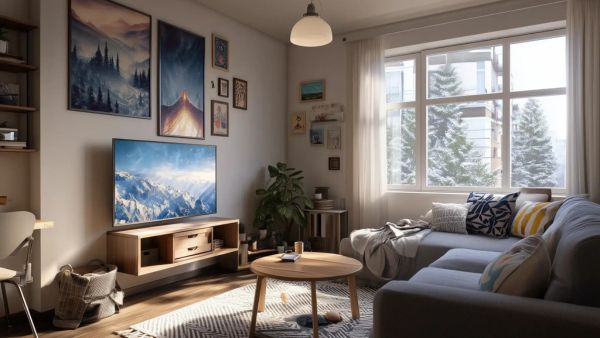
- Go large and bold. A single big poster or framed print can become the room’s focal point, drawing the eye and making the walls “feel” larger. As expert framers advise, “installing one large wall decor item makes it the focal point of a room, giving the perception of a larger space”. Instead of dozens of tiny pictures, think one oversize print above the sofa or bed.
- Think horizontal. A landscape-oriented poster or panoramic image will stretch a wall visually. A horizontally hung gallery wall or a wide print stretches those walls, making the room feel wider. For example, a wide beach scene or a city skyline poster can balance a short wall and trick the eye into thinking the room extends farther.
- Use accent mats. If your favorite art is a smaller print, mount it on a large mat or frame. Expert tip: “Use thinner frames with larger mats to exaggerate the size of small artwork”. Even a small photo can “feel” big with the right border.
Hang Smart: Orientation & Placement
- Stack vertically for height. In a narrow area, try a vertical arrangement. Hang one above another up toward the ceiling. Framers call this the “tall stack” trick – it draws your gaze up. You can even mix frame sizes: “small art can expand your space by stacking a series of smaller framed artwork vertically towards the ceiling”. This makes the ceiling seem higher.
- Center and cluster. If using multiple posters, cluster them like a column or gallery. Keep them grouped (not scattered) so the wall looks intentional. Two adjoining walls of art can also provide breathing room on either side and make the home feel more open. Centered, well-composed displays always look cleaner than a haphazard splatter of tiny prints.
- Lean art when you can. For renters especially, leaning framed posters on shelves or the floor can be stylish and space-saving. Instead of hammering nails, prop art on a console, piano, or bookshelf to add interest low on the wall. This approach “saves you the trouble of hammering holes,” while still using vertical space.
Light Colors & Simple Styles
- Keep it light and airy. Posters with lots of white or pale backgrounds make walls recede. Avoid dark, heavy graphics that swallow the room. Moolwan’s design guide recommends “light, ethereal” abstracts that let in white space – these won’t weigh down a small living area. For example, a poster of a wispy pastel cloud or a foggy landscape can brighten up the wall.
- Limit colors. Stick to one or two main colors in your art pieces. Too many clashing hues on a small wall feels chaotic. Level Frames advises picking a “uniform color scheme and style to stick with” – fewer patterns and colors make the room look calmer. A bit of accent color is fine (a green plant or splash of blue), but largely neutral or analogous tones are best.
- Embrace negative space. Blank areas in and around the art help walls “breathe.” Sometimes the simplest option works: a single print on an otherwise bare wall can open up the space. In fact, one tip is that “less is more” – keeping plenty of empty wall around the art makes the room feel less cluttered. If you have a small abstract print, don’t feel the need to surround it with more pictures; let it float on the wall.
Trick the Eye with Illusions
- Perspective and depth. Choose posters with horizon lines or “vanishing point” perspective. A road or railroad track that seems to go to infinity can mimic a window to another dimension. As design bloggers suggest, imagery of paths, forests, or skylines creates depth: “images with perspective can make us feel like we’re looking out a window or open door”. A poster of a distant beach horizon, for example, can give your brain the sense of far-off space.
- Optical patterns. Geometric or optical illusion prints can also expand perception. Try subtle 3D graphics, repeating patterns, or “trippy” artwork with diagonal lines. According to one source, art that “literally does something tricky with your eyes” – like optical illusion designs – can make a wall appear to recede. (Just be sure it fits your style!) Thin stripes on a poster will stretch the wall, while a checkerboard or grid pattern can make the wall seem to extend outward.
- Vertical lines. As a bonus, vertical stripe patterns (whether in the poster design or even wallpaper) naturally draw the eye up. Moolwan’s guide reminds us that vertical lines make ceilings seem taller, which in turn makes a small room feel more spacious. So feel free to mix in some slim vertical elements.
Renter-Friendly Hanging
No landlord wants a wall full of nail holes. Luckily, many poster-friendly solutions exist: peel-and-stick strips hold light frames securely and remove cleanly. You can also use removable adhesive putty or specialized poster hangers that grip the top. If you still want a great look without hardware, simply lean posters on furniture (as mentioned above) – it looks chic, can be changed anytime, and avoids damage.
Ultimately, make sure your display is easy to reconfigure; when every inch of wall matters, you’ll want to experiment until it really feels just right.
Wall Art Styles That Maximize Space
Here are a few popular poster styles and how they play with a small room:
Digital & Modern Art
Modern digital prints can really pop in a small space. These often feature vivid colors or bold shapes that draw the eye outward.
- For example, an abstract geometric poster in cool blues and pinks (like the one above) keeps the wall light yet interesting.
- When choosing digital/modern art, consider pieces that complement your room’s palette without darkening it.
- A large abstract mural or tech-inspired graphic can serve as a statement piece, especially over a sofa or bed.
Minimalist Prints
Minimalism is all about “less is more,” so even the poster itself might look deceptively simple. Think black-and-white or monochrome graphics, single-word prints, or blank frames and gentle shadows. This Japanese-inspired, minimalist poster setup uses mostly space – it almost feels like part of the wall. Minimalist art takes pressure off the eye because it isn’t busy.
A plain line drawing, a soft beige photo, or a tiny pop of color on white can add charm without clutter. In a small room, a sparse design like this lets the walls “calm down” and appear larger.
Explore Minimalist Art Prints
Photography Posters
A framed photo print – whether a cityscape, mountain vista, or close-up nature shot – is always a classic. Photography prints often have natural depth cues, like perspective and shadows, which help a room feel less flat. In the example above, the urban street photo brings an outside scene indoors.
If your space needs color, a vibrant landscape can bring that greenery/gold into the room without extra plants or paint. Tip: black-and-white or desaturated photos can seem very clean and modern, helping the space breathe.
View Photography Print Collection
Japanese-Inspired Art
Japanese-style posters often feature minimalist nature motifs or calming brushwork. The pair of simple line drawings above looks like something from a modern tatami room, and it adds to the zen vibe. Ukiyo-e (woodblock prints), cherry blossom paintings, or calm Zen scenes in muted colors can visually expand a wall because they’re typically uncluttered.
Plus, using only a couple of tones (like cream and brown) ties into the “uniform palette” rule. A serene Japanese poster can make the room feel tranquil and spacious by keeping things balanced.
View the Japandi Wall Prints Collection
Typography Posters
Typography art can double as decor and inspiration. Look for large, bold fonts on a simple background. The collage above combines different fonts in black/white, which looks cool without too much visual noise.
In a small room, a single word in clean lines can actually expand space by acting almost like a pattern. Position a word-art poster so the edges align with furniture lines or corners, and it can even give your room a modern, custom look.
Explore Typography Wall Art Prints
Each of these styles, from digital abstracts to simple typography, can be tailored to your color scheme and taste. The key is to stick to our tricks above: make it large enough, keep the colors light and cohesive, and place it thoughtfully. With these ideas, even the smallest apartment can feel like it has a bit of breathing room. Happy decorating!